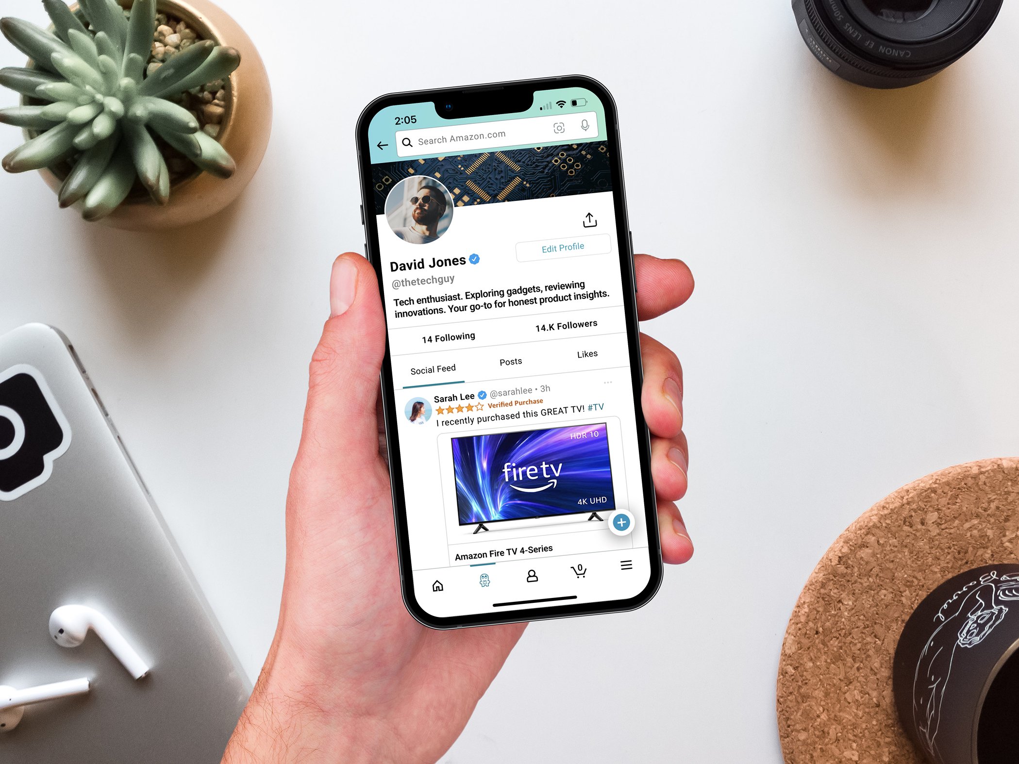
My Role
Duration: Apr 1 - 29, 2023
The Problem
The Goal
“Within the Amazon app design a feature—or set of features—that provides Twitter like functionality. The goal is to draw users way from Twitter, and into the Amazon ecosystem."
Day 1: Understanding the user
Brainstorm
This project was initiated through a collaborative approach with other UX designers through a modified design sprint. To establish a shared understanding of the problem and anticipate potential challenges that might emerge in this case study, we began by brainstorming a list of questions that immediately came to mind.
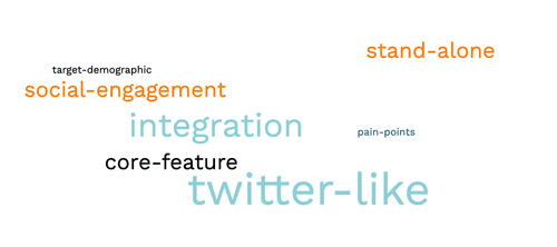
Questions:
Who are the target users of Amazon and Twitter?
Can we identify the key features of Twitter that attract its user base?
How can we encourage users to engage in creating user-generated content, and discussion on Amazon’s app with this new feature?
Can we integrate Twitter-like functionality into the Amazon shopping experience, while preserving Amazon’s core experience?
Or should we create a stand-alone app?
Rapid Competitive Research
In order to answer these questions, and gain more insight into the Amazon and Twitter user experience, we performed rapid user research.
User Breakdown by Amazon & Twitter
Amazon

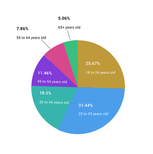
60% of users female
40% of users male
32% of users female
68% of users male
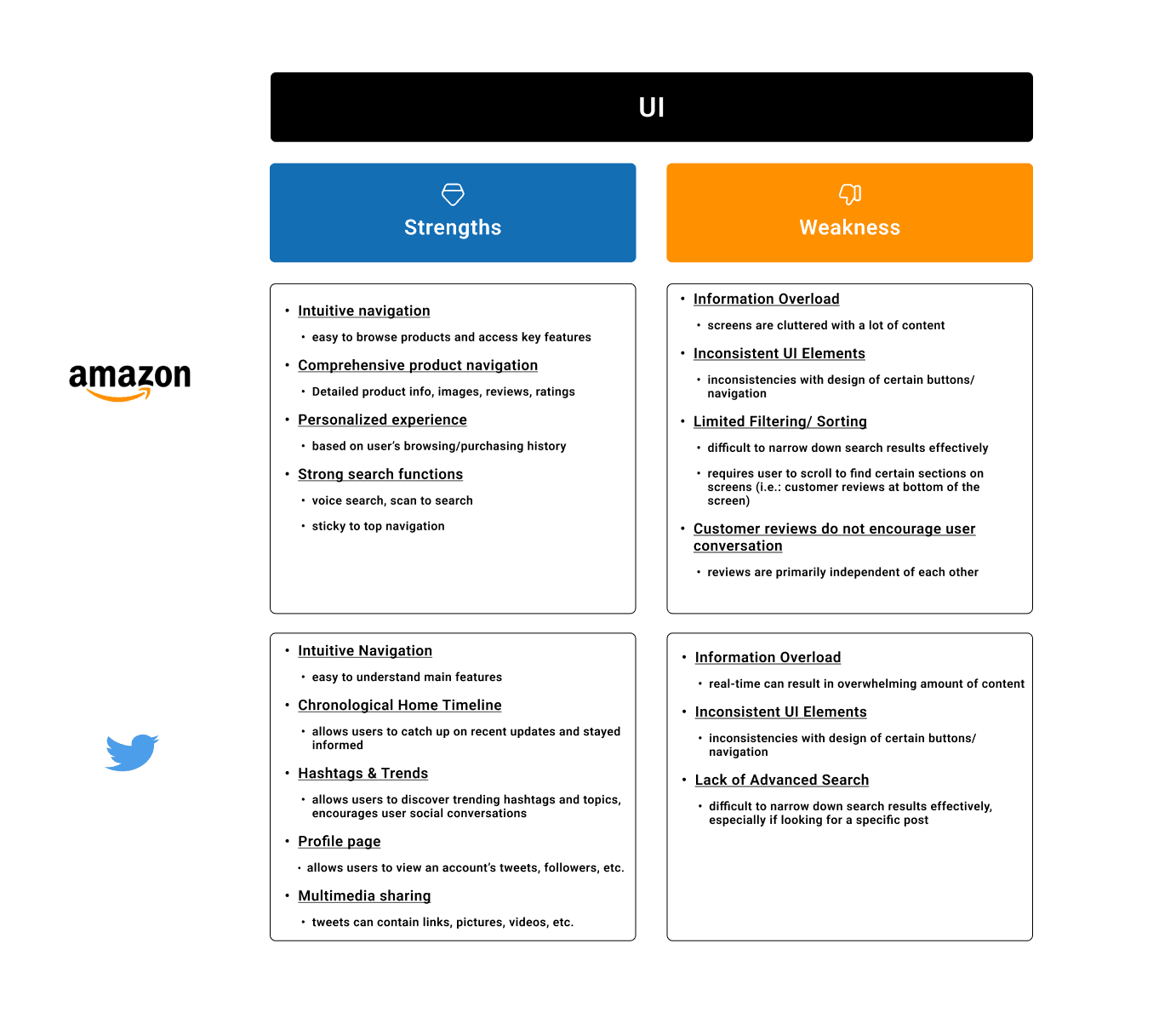
Analysis of Amazon & Twitter App UI
How Might We?
Integrate social features into the Amazon platform?
Encourage users to create and share posts about their purchases?
Revamp the product review and comment sections to facilitate more dynamic conversations?
Design a social feed within the Amazon app that promotes product discovery and personalized recommendations?
Day 2: Starting the design
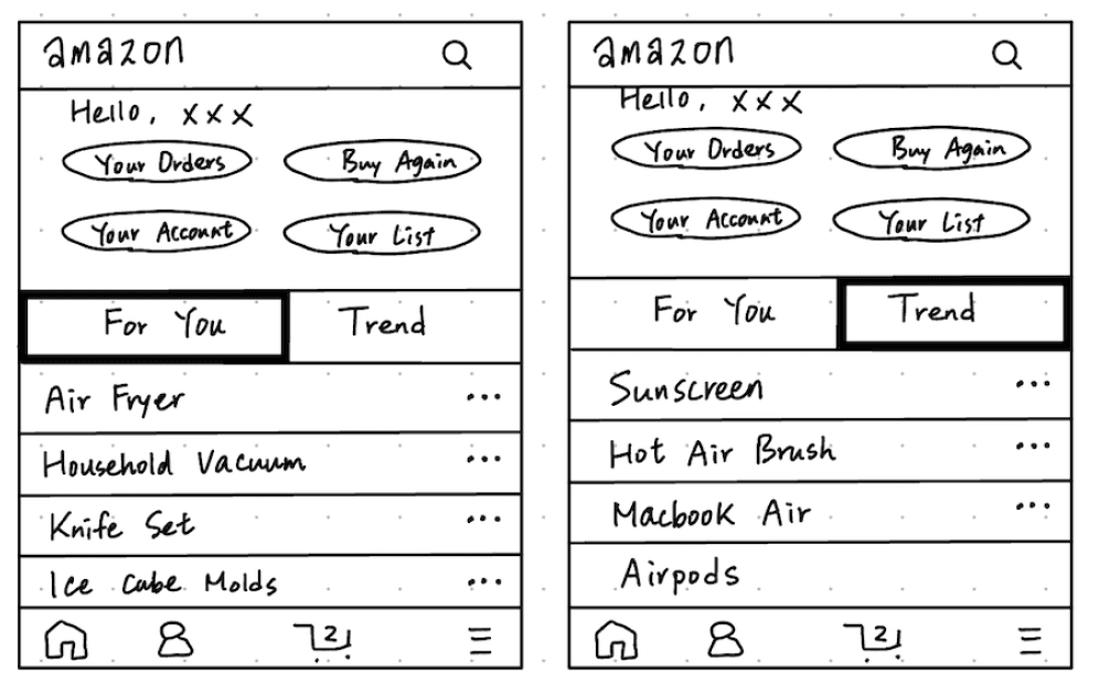
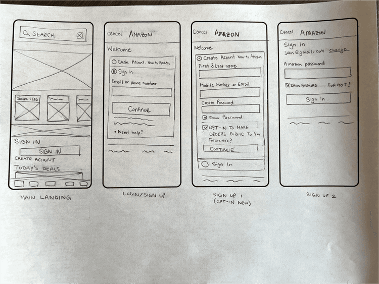
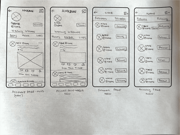
Based on the initial rapid research, each group member began to create initial sketches, independently, which allowed us to explore our own ideas to address The Problem.
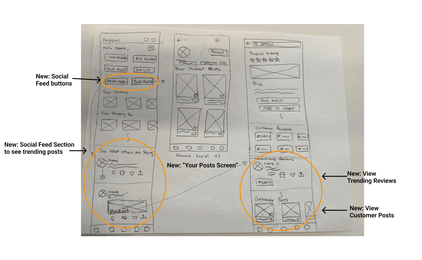
My Initial Design Thoughts & Hand Sketches
Throughout the ideation process, I wanted to ensure that the new features that I would implement would not deter from the App’s core experience, which focuses on providing a seamless shopping experience.
While designing, I kept the following ideas in mind:
Blend Twitter-like functions into Amazon’s shopping app (Not to create a stand-alone app)
Add social feed functionality to encourage user interaction
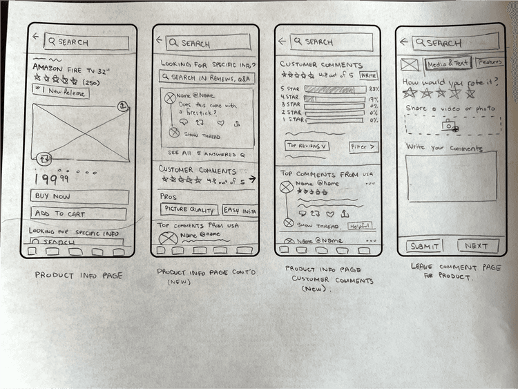
Re-work elements of the user comments/review to facilitate conversations
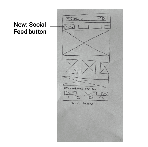
Group Member 2 & 3's Initial Sketches
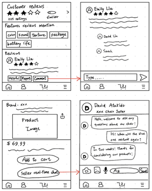
Based on our initial sketches, we had one common element:
Social Feed/ Image Post / Messaging functionality to encourage user interaction
Independent Design Exploration
In this stage of the project, we transitioned from collaborative brainstorming to focusing on our individual design concepts.
Upon reflecting on the collaborative efforts with my group members and my personal design concepts for integrating Twitter-like features into the Amazon shopping app, I maintained my focus on the following objectives:
Seamlessly incorporate Twitter-like functions within the existing Amazon app, rather than creating a separate standalone application.
Introduce a social feed feature to promote user engagement and interaction.
Revamp the user comments and reviews section to foster more dynamic conversations among users.
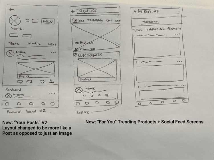
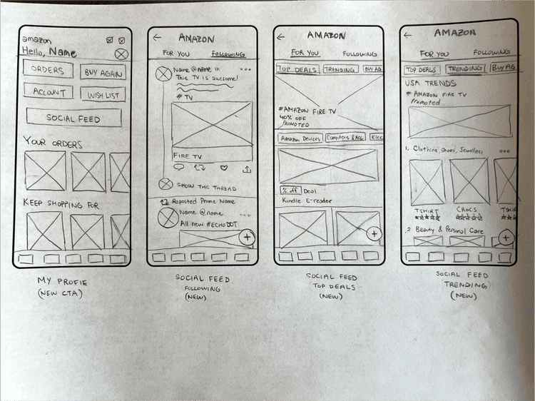
I then refined my hand sketches to depict these specific features in greater detail.
Day 3: Refining the design
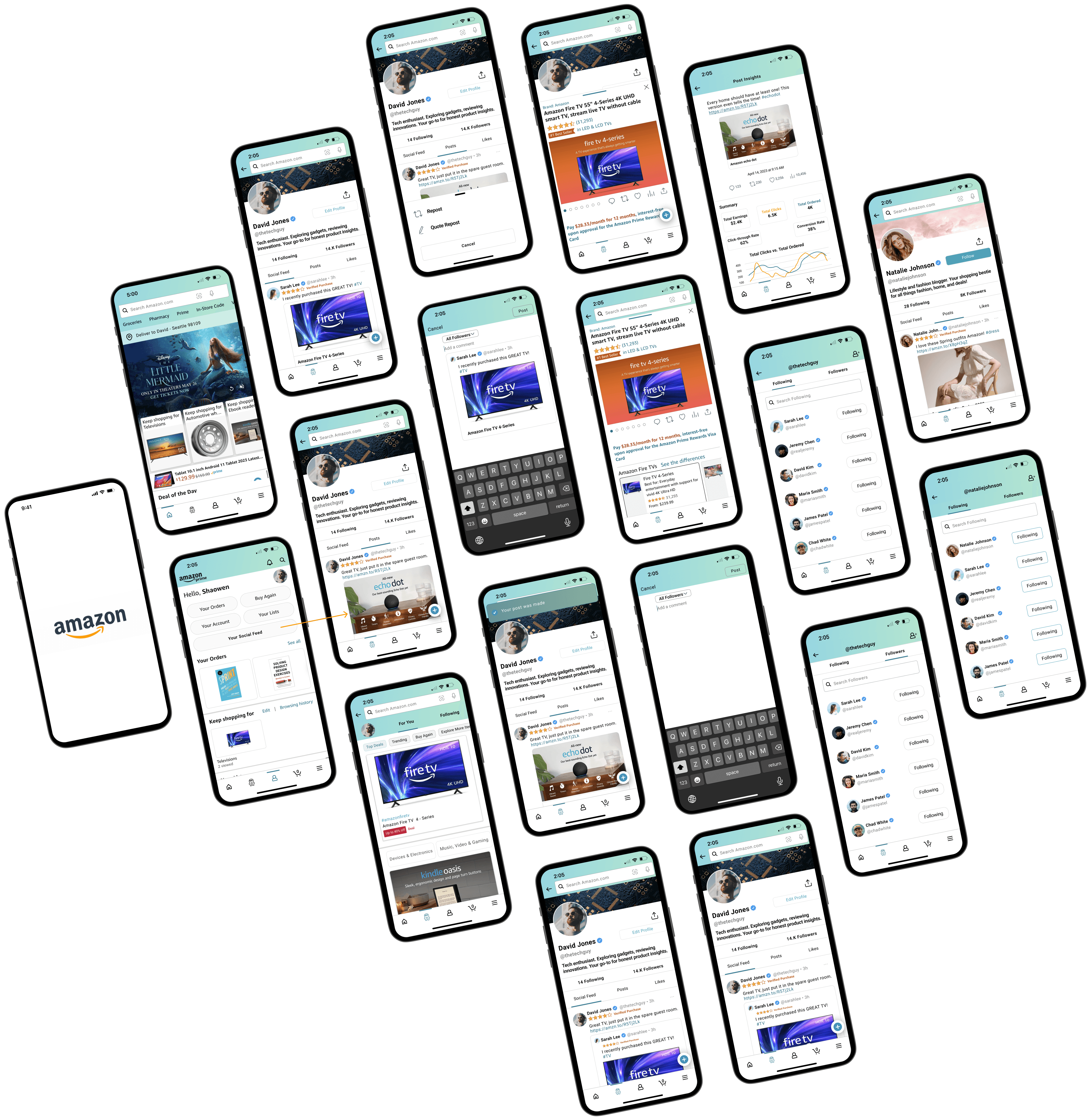
This Case Study was conducted as a modified design sprint, we did not create low-fidelity wireframes. Since the focus was on enhancing the existing app by including Twitter-like functionality, rather than developing a completely separate app, I utilized a combination of screen captures and custom-designed elements to showcase the proposed implementation.
High Fidelity Mock Up
Version 1
Main features implemented:
Social Feed to explore user posts
Engage in conversation with other users about products
Repost, Quote Repost, Like, Share
Follow users on the new Amazon “Social Feed”
View your Post insights
In tandem with creating the high-fidelity prototype, I also developed the usability testing template for this case study.
User Testing
By simultaneously developing the usability test and high-fidelity prototype, I ensured that the features I implemented, remained aligned with my design goals, thus allowing me to concentrate on crafting a more engaging and interactive shopping experience.
Defining the Testing Goals
Determine if users can easily navigate the existing app to find the new Social Feed section
Identify pain points or areas for improvement within the app
Gather feedback from users about how they feel about the overall integration
Core Tasks
Navigate to the New Social Feed Screen
Create Post and Repost other users’ posts
Interact with Posts
Browse products that are shared by other users
Search for other users
Manging Followers/Following
View Post insights
Report a Post
Prioritizing and Implementing Changes
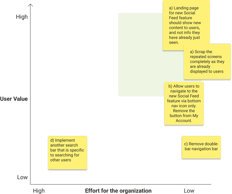
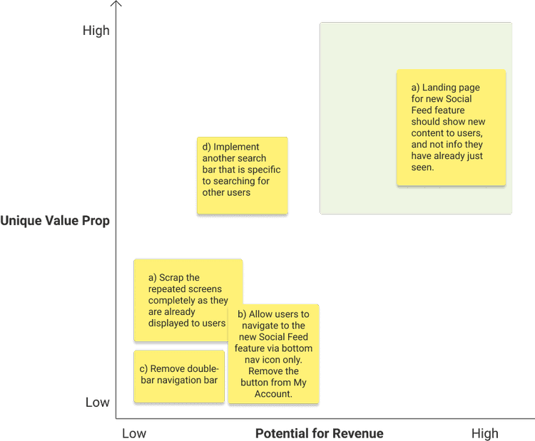
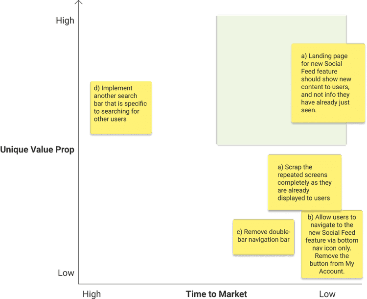
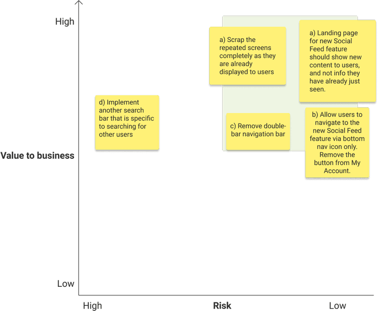
Prioritization Matrices were used to determine which feedback points should be improved.
Users
Based on the prioritization matrices, in most options, many of the options (feedback points) were low-effort implementations, as they involved removing X element or replacing with a page entirely.
One feedback point that could be further questioned, is whether allowing users to search for users on the main Amazon search bar would clutter, or slow down the search functionality. This is outside the scope of this case study.
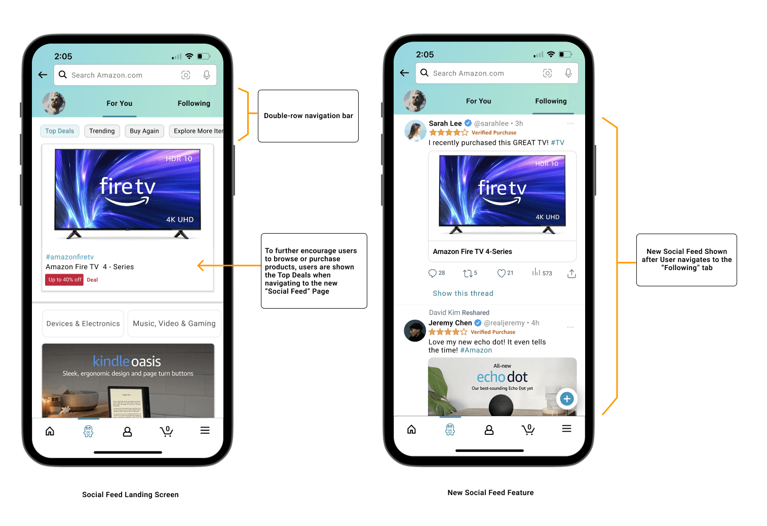
Insight 1: Double row navigation and repeated content confused users
Initially, the Social Feed Page had a double-row top navigation bar.
This was unfamiliar and confusing as it deviated from common navigation patterns
Made it difficult to intuitively understand and navigate through the content
The presence of both “For You” and “Following” in the first row, along with filter buttons for Top Product Deals, Trending Products, Buy Again, and Explore More Products in the second row, contributed to the complexity and confusion
Further, 5 out of 7 users expected to see the Social Feed feature upon navigating to the Social Feed Page, rather than the repeated content
This expectation stemmed from the assumption that introducing a new feature would provide unique content or functionality. This user journey went against their anticipation of fresh content in the Social Feed Page
Before
After
Insight 2: Presence of two buttons for navigating to one screen confused users
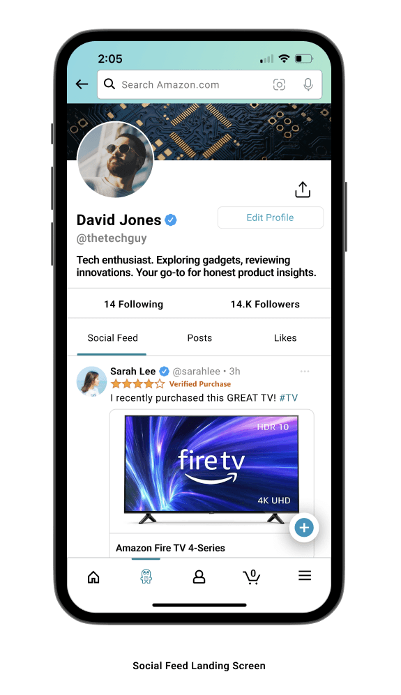
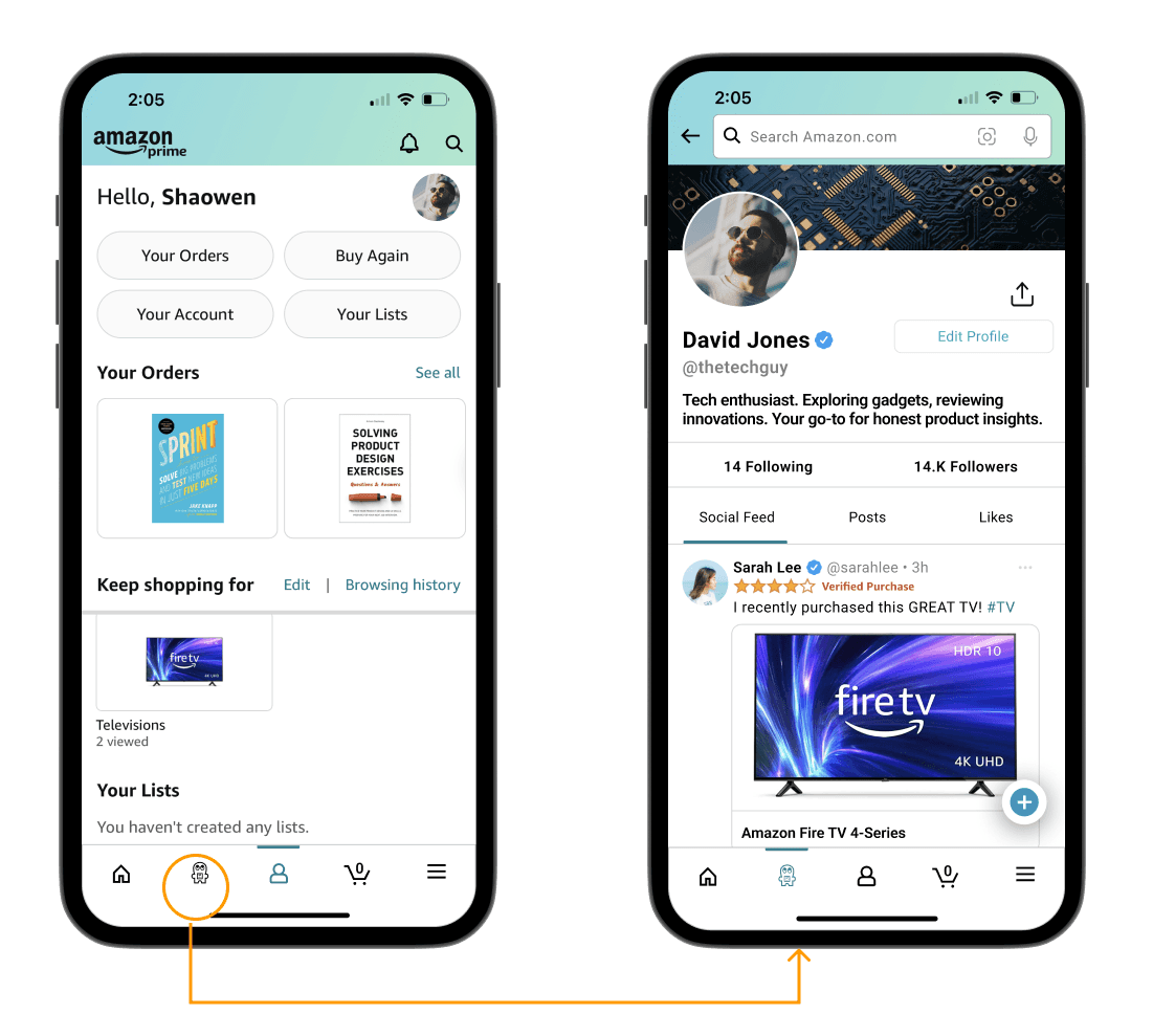
Initially, users could access their Social Feed Page both from a button on their My Account page and through a new Social Feed Icon in the bottom navigation bar.
Users found this duplication unnecessary and disorienting, as it introduced ambiguity in the navigation process and led to inconsistencies in user experience.
Before
After
Removed the "Your Social Feed" button to allow for a single point of navigation.
Styles
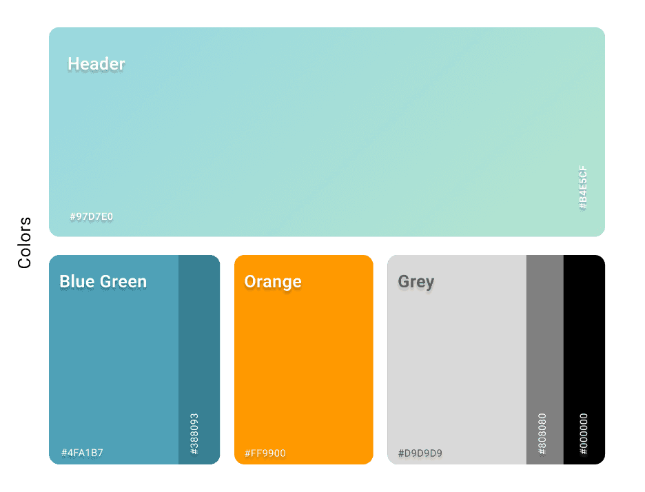
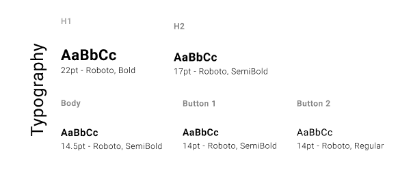
In this case study's implementation, design styles were intentionally tailored to emulate the Amazon app's aesthetics, including its custom font, to maintain a cohesive and familiar user experience.
Going Forward
The Twitter-like features I have implemented into the Amazon shopping app, not only serve as a strong starting point for attracting Twitter’s existing user base to switch platforms, but also supplement the current Amazon shopping experience.
Next Steps
To further develop the seamless shopping experience that Amazon delivers, I propose to explore the following features:
Social Shopping Lists: Allow users to create and share shopping lists with friends and followers,
Enable users to collaborate on purchases or discover new products through social connections
In-app Messaging: Introduce a user-to-user messaging feature
Enable users to directly communicate with followers, interact with Amazon sellers, coordinate group purchases, etc
Live Video Shopping Events (“Live Auctions”): Introduce a Live Video Auction feature where the host auctions items off to viewers who watch the live stream
Encourage users to engage more with Amazon sellers, and other users
